Worlds Most Popular Responsive Frameworks
In today’s time ‘Responsive Design’ is hugely in demand, and almost every web entrepreneur wants his website to be responsive so that it becomes compatible and gets fit to be seen on all possible devices with which a person can visit the website. Another reason behind the massive popularity of Responsive design is that it counters the need of a mobile site pretty well.
However, making responsive websites is not as easy as it seems, and to make one, it requires a lot of skills and knowledge about responsive frameworks. Now you must be thinking what exactly are these responsive frameworks?
A Responsive Framework is a library of codes that you need to make a responsive website. By using framework, you can avoid writing common CSS codes, which turns an ordinary website into a responsive one. In other words, you can say, Responsive Framework is a form of conceptual structure of a website, which helps you begin working on your project with a pre-written set of codes, which makes it adapt to different screen sizes. And here is the list of world’s most popular responsive frameworks along with their advantages.
1 :- Less Framework 4
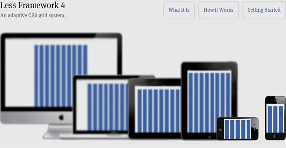
The Default layout contains 10 Columns and is 992 pixels wide. It is mainly suitable for desktop PCs and Laptops, and also suited well for the tablets in landscape orientation. Additionally, it works pretty well with all old browsers.
The Tablet Layout uses 8 Columns at 768 pixels. It is best suited for iPads and other tablets, and makes it easy for web readers to keep reading for long hours, when used with 6 column wide text.
The ‘Mobile Layout’ and ‘Wide Mobile Layout’ uses 3 and 5 Columns, which covers the 32o and 480 pixels width respectively.
To work with Less Framework 4, you must have immense expertise in HTML and CSS. The best part about this framework is that you can always edit the codes as per your requirements, but needs to keep the License comment intact at the top of the CSS file, or link back to the site from your website, as it is released under the MIT license.
2 :- 52 Framework
It is an awesome framework to use for responsive web development. ‘Enavu Network’ is the brain behind the development of this great Responsive Framework, which uses the combination of HTML 5 and CSS3 with JavaScripts. And as it goes with its author’s saying i.e., HTML5 + CSS3 + JS = Future.
Many popular blogs like Smashing Magazine, Web Resource Depot, Specky Boy, Design Shack and Dev Snippets have already praised this particular framework for making responsive designing as simple as it could ever be. Apart from this, it works well with all modern browsers.
3 :- Inuit.Css
Inuit.Css is not just another responsive framework, but in fact more powerful and scalable than you might have ever used or seen, as it uses Sass-based, BEM, OOCSS Framework.
Setting up the inuit.css is pretty simple, but as it’s a Sass-based framework, you need to setup the Sass either via GUI or the command line. Basically, it is meant for people who need a powerful inventory of objects and abstractions. It is developed by Harry Roberts, and released under the Apache License, Version 2.0
4 :- Bootstrap
Bootstrap is one of the most utilized responsive frameworks in today’s time. Mark Otto, Former Web Platform Designer at Twitter, and Fat Kun, are the ones who made Twitter Bootstrap possible. It is made using the LESS CSS, and is compiled by Node.
As far as its features are concerned, the Bootstrap uses a 12 Column responsive grid, a variety of JavaScrpt plugins, form controls, and typography along with many other components like Dropdowns, Button groups, Navs, Breadcrumbs, Labels and Badges etc.
5 :- CSSHorus
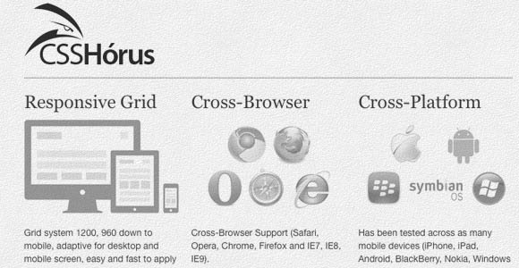
If you need to make responsive websites quickly with ease, then CSSHorus, would be the perfect choice. It’s a 16 Column grid based framework, which comes packed with basic style formats, which include; Resets, Lists, Table, Form, Links, Typography, Button and Basics, along with LESS CSS and RTL.
Its developer João Firmino has made it in such a way that it supports all modern web browsers including the good old Internet Explorer 7, and it also works pretty well with almost all Smartphones.
6 :- 5 Grid
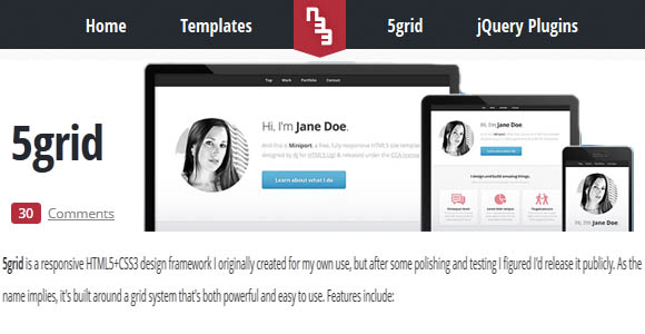
Jeremy Stephens developed the 5Grid framework for his personal use. However, after completing the codes, he released it for the public use, which is now being utilized by a great number of developers, who love to explore the responsive design beyond its boundaries.
The 5Grid Framework comes with a simple, concise syntax, and numerous advanced features, and uses HTML5 and CSS3 as its foundation. For developers, it provides them with a professional and highly customizable mobile User Interface. Currently, its version 0.4 is available for free download.
7 :- Foundation 3
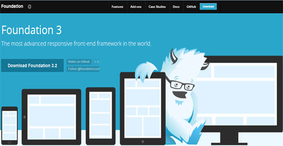
The brain behind Zurb, is the brain behind Foundation 3. One can easily say it’s the most popular Responsive Framework, which is currently being used by many industry giants like Pixar Projection, Mozilla on WebFWD, and National Geographic.
The Foundation 3 is a complete and powerful framework, which is developed not just using pure CSS but Sass and Compass. As far as responsive design is concerned, it is adaptable to any computer, tablet and smartphone screen, and lets you make a ‘complete responsive’ website. By the term ‘Complete Responsive’ includes the Typography, Buttons, Navigation, Forms, Images, and of course the Grid.
The developers can also seek support on Github.
8 :- YAML 4
In YAML 4, the word ‘YAML’ stands for Yet Another Multicolumn Layout. It has been 7-8 years, since YAML is in existence, and it is being continuously developed by Dirk Jesse, and released under Creative Commons License. However, if used by commercial software developers looking to release their product under different license needs to purchase it under Commercial License. It’s yet another strong framework, which let the developers make an amazingly responsive websites in quick time. It supports all leading web browsers including Internet Explorer version 6+.
As far as its features are concerned, it has got an amazing flexible 960 pixel grid system, a form toolkit with theme-support, optimized typography, matched building blocks for rapid prototyping, etc. In addition to this, all layout modules made keeping HTML5 and CSS3 in mind.
9 :- Titan Framework
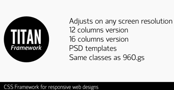
For Titan Framework, one can easily say that it’s the most comprehensive framework developed especially to make websites that can get fit to any possible screen resolution using maximum width. On the main website, its developer Kriesi, tells that he was a big fan of 960.gs but finds it difficult to work on 1920px width, and that prompt him to make the ‘Titan Framework’.
This framework is made using the same CSS classes used in 960.gs, which eventually makes it easy to work with this. It comes in two variants of 12 and 16 columns, along with a PSD template for 960px size.
10 :- Grumby
The 960 Grid system, which is widely popular amongst web developers is the main foundation of Grumby. But it is more flexible and refined than that, and comes packed with design PSDs and multiple kinds of grids, which provides the developers with more flexibility while working on projects. Its users can download it as per their needs as it comes in four different packages, which includes a 12 Column Pack, 16 Column Pack, Hybrid 12/16 Column Pack, and Master Pack, which contains all other three packs.


