Top 10 Examples of Pop-up or Opt-in Subscriber Form
Generally, bloggers and webmasters are desperate to have a massive subscriber base within a short span of time. However, that used to look next to impossible just a few years back. But now as Pop-up or Opt-in subscriber forms are in place, getting subscribers in quick time has become a lot easier. However, if you are going to use them on your blog or website, you should also be careful with its placement and utilization. As if a pop-up subscriber form is used in an improper way then it may annoy your website visitors. Therefore, you should always take some preventive measures to avoid it and keep your visitors engaged by providing high quality content.
While using any kind of Pop-up or Opt-in Subscriber form, there are certain preventive steps that you can take. This would boost your chances of getting more subscribers than you would ever have, otherwise. However, to make you aware of how people or different websites are using a pop-up subscriber form, we present you with a detailed list of top 10 website examples along with the information on how they’re used, and how it may have an impact on their business.
So let’s start!
1. GideonShalwick
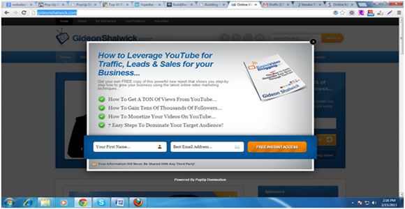
GideonShalwick.com is a great website owned and managed by Gideon Shalwick who offer tips on Internet marketing, video production, video marketing, and entrepreneurship. The website has a large base of 62,000+ subscribers, for which the credit goes directly to the Pop-up subscriber’s form. It pops-up as soon as you open the website, on which Gideon Shalwick has described why you should subscribe to his website, and what you’ll get for free soon after you join it. This is one of the easiest ways of informing the readers about your blog or website and what you’ll give them once they subscribe to it.
2. Social Triggers
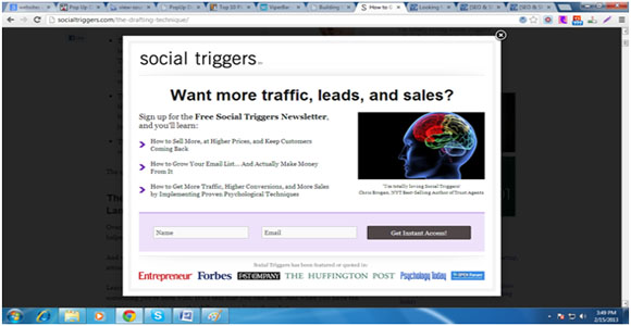
Derek Halpern is the founder of Social Triggers, and is a brilliant marketer and entrepreneur. It’s been 4 years since he is running this blog (Social Triggers) to help other webmasters on how they can convert their visitors into local subscribers, convince them to buy their products or services (if any), and make others share the published content. In short, he provides you with the psychological research and business case studies into your business. Currently, he has a subscriber base of more than 1, 00,000 people with a twitter following of 26.1K. To make this possible he has used a pop-up subscriber’s form which gets opened only and only if you visit the listed blog posts. However, if you close the opt-in from, it won’t make you annoyed by popping up every time you visit the blog/website. Additionally, he has also provided the ‘Close’ button that is available on the top right corner of the form.
3. Underground Online Seminar
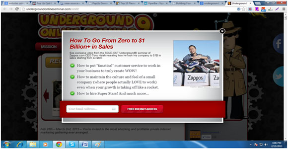
Underground Online Seminar is one of the most happening sites for internet marketers, as it organizes seminars where people come together and share their own marketing skills on one stage and learn from others as well. The seminars are organized at regular intervals, where leading professionals like Bob Parsons, Founder, Godaddy Inc. take part and share their ways of making money online. However, it takes a lot of money and time to organize any seminar. And to make it successful a large base of subscribers is always needed. For which, Undergroundonlineseminar.com uses an opt-in subscriber’s form, which pops-up instantly when you open the website for the first time. However, if you close it down once, it will never come again (no matter if you visit the website again or browse through its pages) unless you clear all your browser history and cookies.
4. AllexWhalley
AlexWhalley.com is a great new site that provides unique tips and tricks to build, rank and get profit from niche websites to its readers and subscribers. This website also uses the pop-up subscriber’s form, but very cleverly than many others, to attract more people and enhance its subscriber base. However, the strategy to use is altogether different than what we have seen in the above three examples. Once you visit the website, it won’t throw the pop-up form right at the beginning. In fact, you’ll get to see that only if you scroll down the website and as soon as you scroll-up, the form disappears. It’s a site wide form that catches your attention instantly because of its bright color. However, there’s one thing that may annoy many of your visitors i.e., it pops-up every time you scroll down, and this can really make things worse for the blog owner.
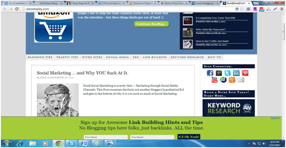
5. Amyporterfield
Amy Porterfield is a popular social media strategist, and runs this website with the same name amyporterfield.com. She has been featured on many globally acclaimed news and technology based websites like Mashable, The Huffington Post and Forbes, and she really knows how to build the subscriber base within no time. For which she uses two subscriber forms, which includes the opt-in form, and the one that have been integrated on the homepage of the website, that comes soon after the user closes the form without filling in the details in the pop-up form. However, she also ensures that her readers don’t get annoyed by the pop-up form, for which she uses the cookies that gets stored in the browser, and keeps track of the visitor has come again using the same browser. With this, the opt-in form used for adding more subscribers doesn’t get displayed again until and unless the user visit the website after deleting the entire browser history.
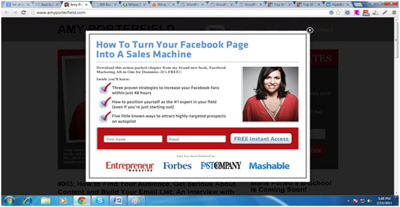
6. Daniel Watrous
Daniel Watrous is a famous web developer, who began his journey in web development in the year 2000, and www.intel.com was his first ever project he worked on as the lead developer. Though, as he is already a popular web developer, he already has a large base of fans and subscribers, who follow his website danielwatrous.com regularly. However, it is never enough for a webmaster, and he being one of them also tries out different ways to build and make his subscriber base more powerful, for which he uses a site wide opt-in form in the footer area of the website, which grabs users attention as soon as it opens-up, asking them to provide their name and email if they want to download his free software named ‘OptinCrusher’. Instead of providing the close button on the form, he has used the ‘Hide button’, which if clicked takes the form down, and displays another button in the same location with the name ‘Special Offer’, which facilitates people to fill in the form at an appropriate time (whenever the want).
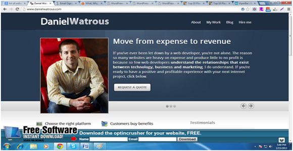
7. Blog Marketing Academy
Blog Marketing Academy is a one stop place for bloggers to learn about popularizing blogs and how to drive high quality traffic on them. David Risley, the man with 15+ years of blogging experience and who runs PCMech.com, is the brain behind BlogMarketingAcademy.com. He knows pretty well what it takes to drive the traffic to any blog/website and how to expand the subscriber base. And that’s what he teaches here, and to promote this venture, he also uses an opt-in subscribers form to enhance its reach and make it known to people. The opt-in form he uses contains all the required information that is necessary to attract new bloggers and webmasters and makes them subscribe to the website. This website also uses the pop-up form like many of the websites stated above do i.e., you’ll not get to see the form again if you close it down, unless you clear the browser history and cookies, and open the website again.
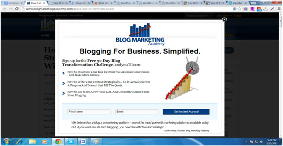
8. BizCommunity
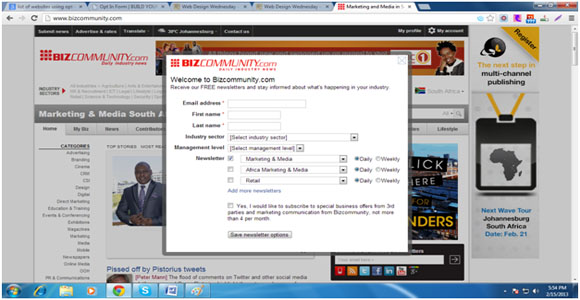
BizCommunity.com is like a complete industry e-news center, as it covers a wide range of industry sectors that includes, Marketing & Media, Medical, Mining, Agriculture, Arts & Entertainment, Automotive, Lifestyle, Legal, etc. Though it already has a massive base of website subscribers and drives thousands of visits via search engines, but still it always looks forward to increasing its subscriber base, for which it uses a pop-up subscriber form. The pop-up form only comes up at the beginning and only if you visit the website for the first time. However, there’s one thing that may annoy the interested subscribers i.e., the form contains many fields, which are to be filled by them before submitting, and on many occasions it has been observed that people avoid filling that much details for subscribing it.
9. The Email Guide
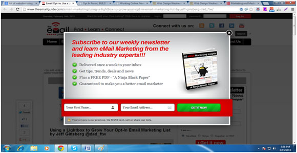
The Email Guide is a perfect place to learn all about email marketing. This site ranks pretty well on search engines, and has a large base of subscribers. This website also uses a pop-up subscriber form to make people aware of the benefits of subscribing it. The form pops-up as soon as the visitor lands on the website containing all the necessary information that describes why should someone subscribe, what he/she will get, and how frequently will he/she get it in the emails. And that’s really like a perfect way to use the opt-in subscribers’ form for collecting the user data and expand the subscribers base. The functioning of the opt-in form used on this site is identical to what many of the websites listed above offers, like; you won’t see it again until you clean all your browser history and delete all the cookies stored in your system.
10. Evancarmichael
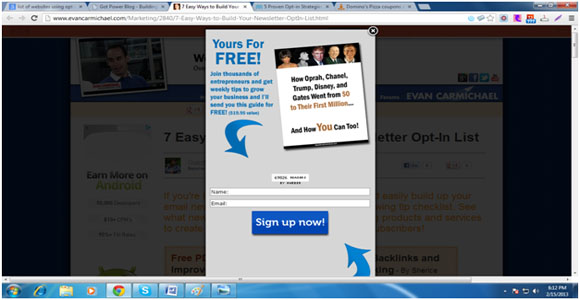
Evan Carmicheal is a community of globally acclaimed entrepreneurs, who offers advice to many new and budding entrepreneurs. According to the stats mentioned on the website, it has already helped 14 million entrepreneurs, so you can assume its subscriber base pretty easily. However, to attract more people and help them with their entrepreneurial skills, it has used a long but not wide enough pop-up subscribers’ form, which if closed once, will only pop-up if you visit the website for the first time. The form comprises enough catchy details and lists number of users (already subscribed), which is quite a good way to present why would people subscribe it and what would they get.
