The Theory of Call to Action, and How One Should Implement It
Whenever a website is made, there are reasons behind it. It can be anything like; promotion of services, product selling, entertainment, provide unbiased information, affiliate marketing (generating revenue from ads), etc. However, to accomplish the real motive behind running a website, a ‘Call to Action’ button is always necessary, something that propels people to take a step after reaching your site. But on many occasions, it’s observed that people find it extremely difficult. And the real motive behind ‘Call to Action’ buttons often falls flat. That’s because there are various things that are related to every CTA button, and one must understand it completely to utilize it and make things work accordingly.
First off, for a Call to Action button, you need to analyze the entire structure of your website and have at least a minimal understating about graphics designing, as then only you would be able to produce high quality CTA buttons for your website. However, if you don’t know how to design, then you can outsource your work for a quality service.
For a conversion oriented CTA button, there are five strategic elements that you need to implement, which starts with the color scheme. The Color scheme is what matters the most. The second most vital element is the size of the button. And there’s a theory behind this i.e., what people will see, is what they’ll buy. The larger you’ll make it, the more it will be highlighted on the web page, and will eventually attract the visitors to take action. The third most important thing is the placement of the CTA button. Then comes the Whitespace, which is then followed by the Text.
Let’s discuss the Color first!
Color
First of all, try and visit some websites that catches your fancy and asks you to perform certain actions, via buttons, then analyze it as an end-user, and ask yourself a few questions like; what made you notice the button, what made you click on it. Here’s an example.
Given below is an image of the homepage of Gmail.com. Can you notice the red button on the right hand top corner? It looks slightly different from other elements available on the page. Try taking a look at the sign in button available just below the form fields, isn’t that a good example of a CTA button? Read the text over it. It says ‘Create an Account’ and ‘Sign In’ respectively. Now ask whether the different color scheme used for these buttons has managed to draw your attention or not. We’re sure most of you would agree.
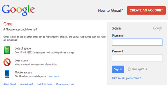
There’s another thing that you should notice here, and that is the background color where the CTA button has been implemented. It’s very light in comparison to the button’s color. One should always use this kind of color scheme, especially where the CTA button has to be placed.
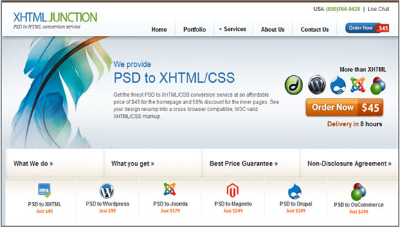
Let’s take another example of a popular PSD to HTML provider, XHTMLJunction.com. Take a look at the image below, and try to identify two well placed ‘Call to Action’ buttons. The first one that says ‘Order Now – $45’ is placed along with the Menu bar besides the Logo. The second one that says ‘Order Now – $45’ along with the tag line ‘Delivery in 8 hours’ is placed just below the logos of some of the most popular CMSes, which are used to make high quality websites. Look how different color scheme is used on both the buttons, one displays the message, and the second highlights the price. This kind of color usage in CTA buttons is well known for lead conversion.
However, it would be better for you to perform A/B testing on your website using a variety of color combinations and then select the one that performs better than the others. Additionally, you should use two shades of the color you choose to make your button with. The first one as the main color, and the second one, which should be a little darker than the primary color, as the hover color. This will help users to recognize the button.
Size Matters
Size of a CTA button plays an integral part when it comes to conversion of web traffic into sales, but web designers often neglect it. But the larger you make it the better it will convey your message to the visitors. This is because the big buttons tend to catch the attention of the users pretty quickly, which is your main motive of having a website because that’s where your business will come from. However, you must not ignore the content of your web page, as people will definitely read what you do, how you do it, after sales service (if applicable), etc., before they buy from your website or subscribe to it for newsletters, blog posts, etc.
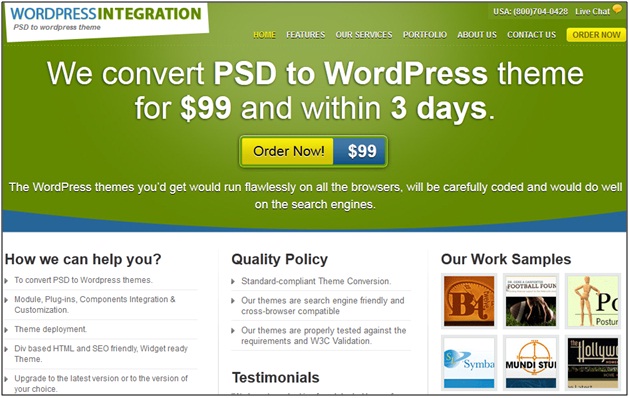
Here’s an example of WPintegration.com. Look how big the Call to Action button is on the website. It makes people understand what the company offers, the prices and the time of delivery. With this CTA button, the company has been able to convert a lot of its visitors into business.
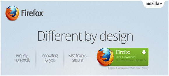
Now let’s take another example of Mozilla Firefox’s official website, and see how big the button for directing visitors to download it has been used. And when you try and analyze it in the real time on the website, you’ll notice that it would be the first element to catch your attention.
Placement
Placement is also vital if you really want to convert your visitors into sales. The most common phenomenon is to keep it above the fold, as that’s what the visitors sense at the first instance. However, this is not a hard and fast rule, which you cannot break, but in fact, it would be better if you can use two or more CTA buttons in one page. One or two should be placed above the fold, and the other one can be place below the fold. By doing this, you would give flexibility to your users to sign-up or buy without moving the scroll bar up and down, which will definitely go your way.
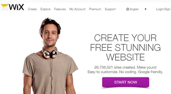
Here’s an example of Wix.com that uses the ‘Start Now’ CTA button well above the fold. And look how clean the button is, and reflects urgency with a short and clear message just above the button that makes people to take action.
Now let’s take up the case of SEOmoz. It has used two different CTA buttons, namely; ‘Start your Free Trial’ and ‘Learn More’. The first one takes the people to a sign-up page, and the second one leads them to the information about the acquisition of getlisted.org. Both the buttons are placed well above the fold, and states the message clearly.


