15 Stunning Examples of Motion Design in Mobile Apps
Despite being a very small element of mobile design, motion design (or so-called interactions) plays a significant role in turning the overall user experience of a mobile application into a fun and engaging activity. Adding an appealing and playful flair to the user interface of your mobile app, not only it gives your app a much more refined look and feel, but also it keeps the users hooked and interested for a long time – enticing them to take the desired action immediately. In fact, Motion design has now become a new standard for designers to represent the key elements of their designs.
While the Apple has been experimenting with Motion design for a long time, other innovative companies, like Uber and Netflix, has also started hiring motion designers to take the full advantage of this amazing animation technique. That’s because, in addition to making a mobile app look aesthetically pleasing, Motion design offers several other generous benefits to both app owners and designers, a few of which are listed below:
- Establishes application and brand identity
- Defines app structure and interactions
- Masks slow load times
- Reveals hidden gestures
- Provide users instant feedback on their actions
- Make your app stand out in a crowded app store
Needless to say, all these points are also imperative to make any mobile app successful and popular. So if you are planning to incorporate Motion Design into your app and looking for some inspiration, stop searching anymore and instead take a look at these 15 beautiful and subtly animated examples of motion design in mobile apps!
Weather by BeardChicken:
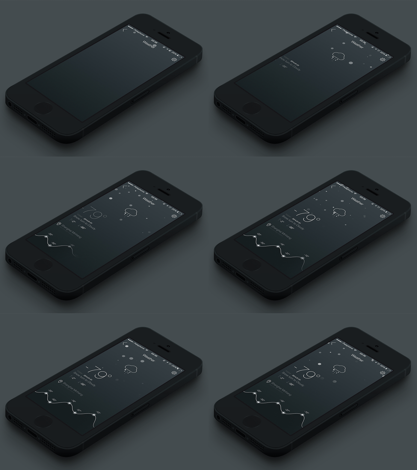
How is the weather outside today, frightful, blustery or delightful? Well, just imagine how easy and amusing checking the weather will be with this super smooth and gorgeous weather app design. Isn’t this work is exceptionally elegant and beautiful?
Workflow Payment by Barthelemy Chalvet:
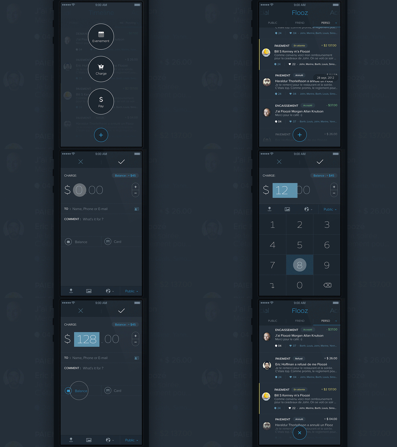
If you’re a die-hard fan of content that moves with the scrolling of the screen, then this one is going to be one of your favorite app designs. With nice animations that are undeniably fluid and fast, this gorgeous app solely focuses on offering a neat and handy payment procedure to users. A great concept for a payment card, indeed!
Life Minimal App by Budi Tanrim:
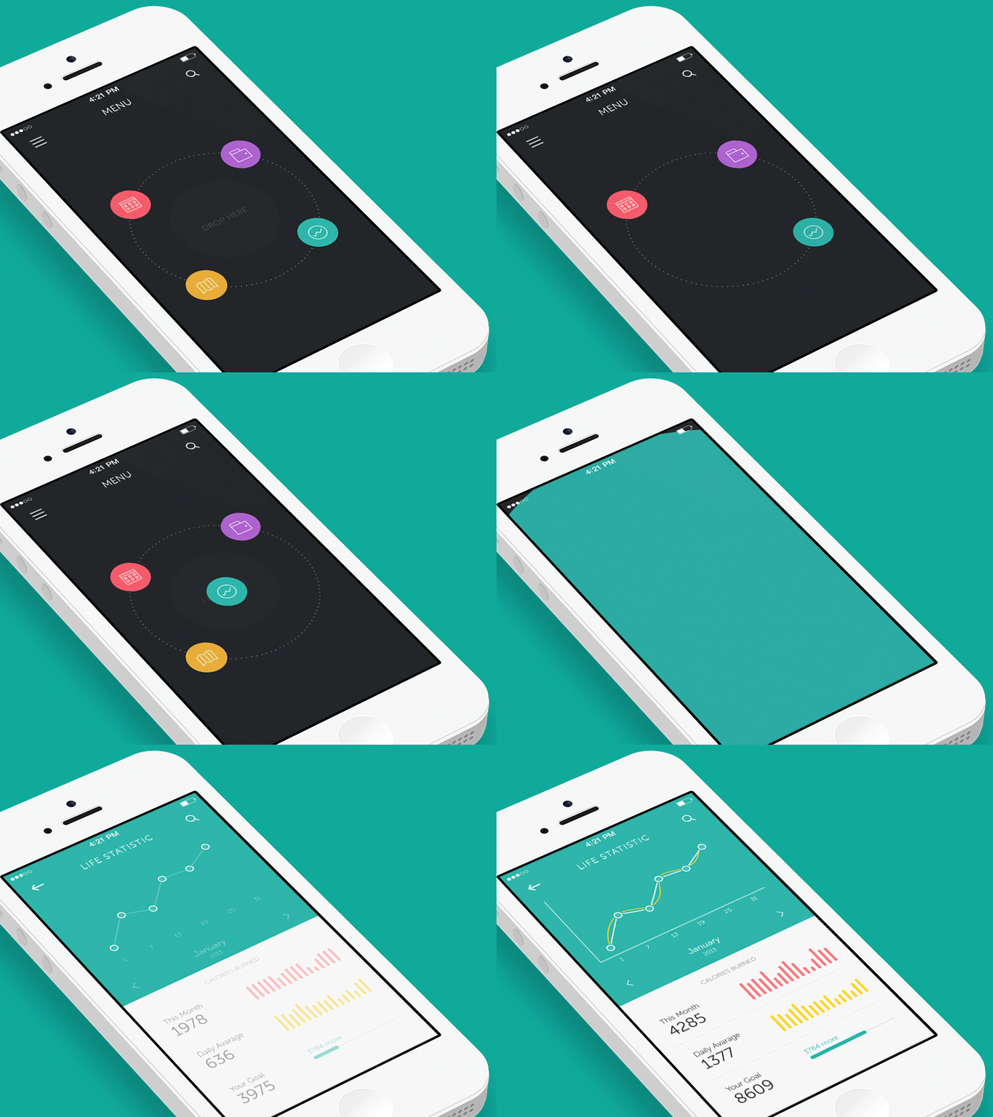
An ideal example of the perfect use of great visualization and transitions in a mobile app! Do you even know this amazing animation is the result of 12 grueling hours of hard work on Adobe Photoshop and After Effects?
Application Process Interaction by Johny Vino:
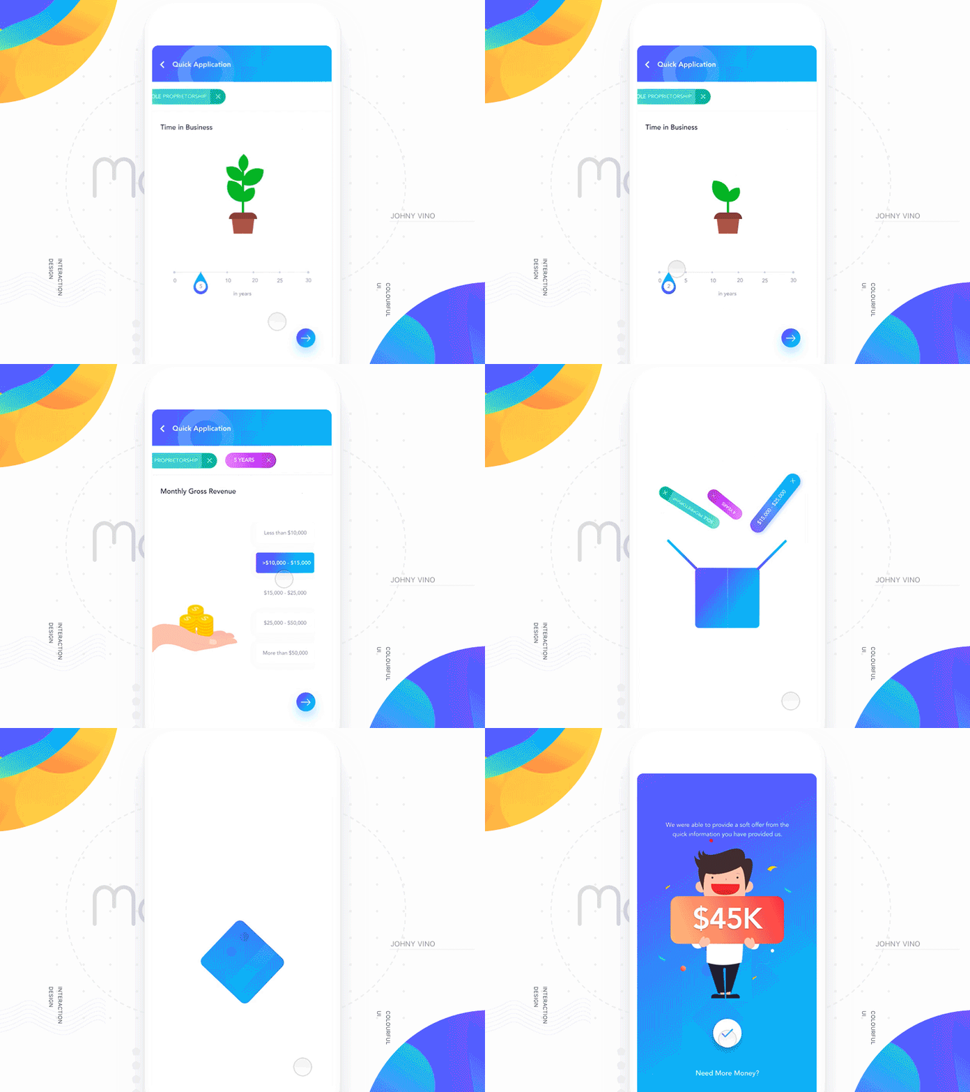
This app teaches us how we should use the most subtle elements of motion design to deliver users the most satisfying and alluring results. Look at this beautiful app: as a user increases the time slider, the plant grows larger and gives the user a visual feedback based on the input provided.
Gif for Social Network by Sergey Valiukh:
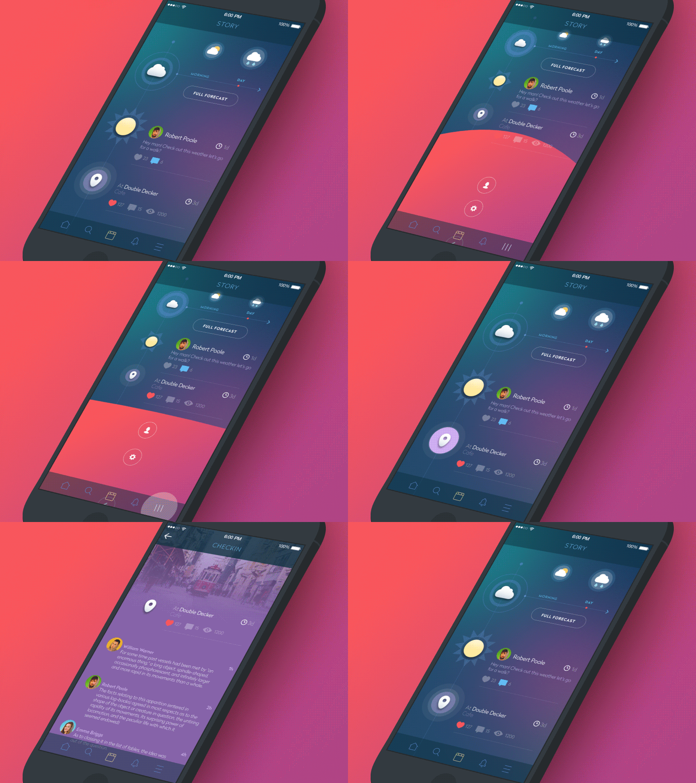
Instead of ultra-new interactions, this social network app presents simple motions that are based on bright and colorful UI accents. The main idea here is to show how a user can access each app section without leaving the current screen and find the way to the start point. Undoubtedly, these kinds of apps need to be very fast, dynamic and clear.
Product Card Animation by Alla Kudin:
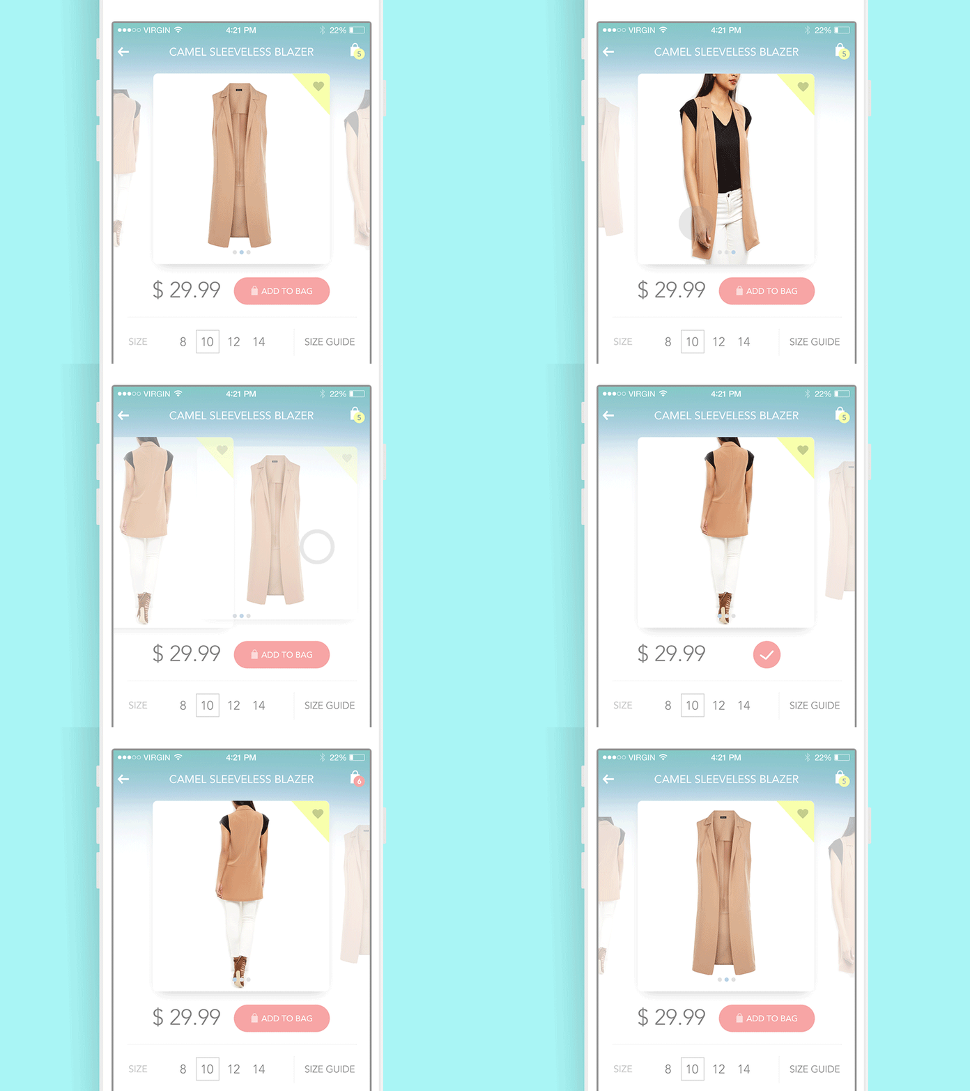
This design concept features motion design within a product card in an eCommerce app. In this app, animated elements immediately inform the user about the completion of an action. This leads to a very high level of usability, which not only provides users fast and easy micro interactions but also saves a lot of key data within a single screen.
Showtime App by Nort:
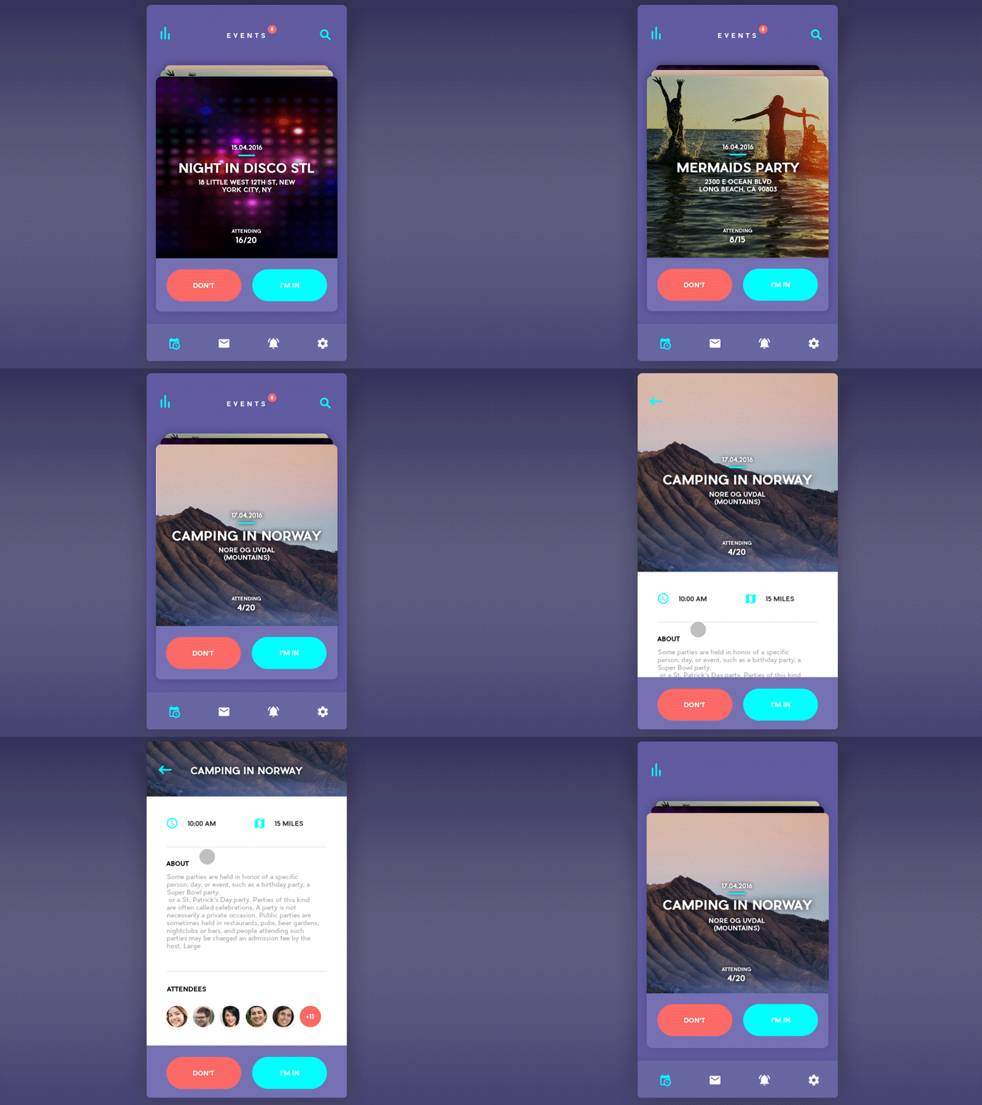
This app is the most ideal for people who are constantly on the lookout for some nice weekend getaways. With simple and easy to use micro-interactions, this elegant app helps users choose the best and hottest place in or near to their own town.
Delete and Assign Task by Tob Siripak:
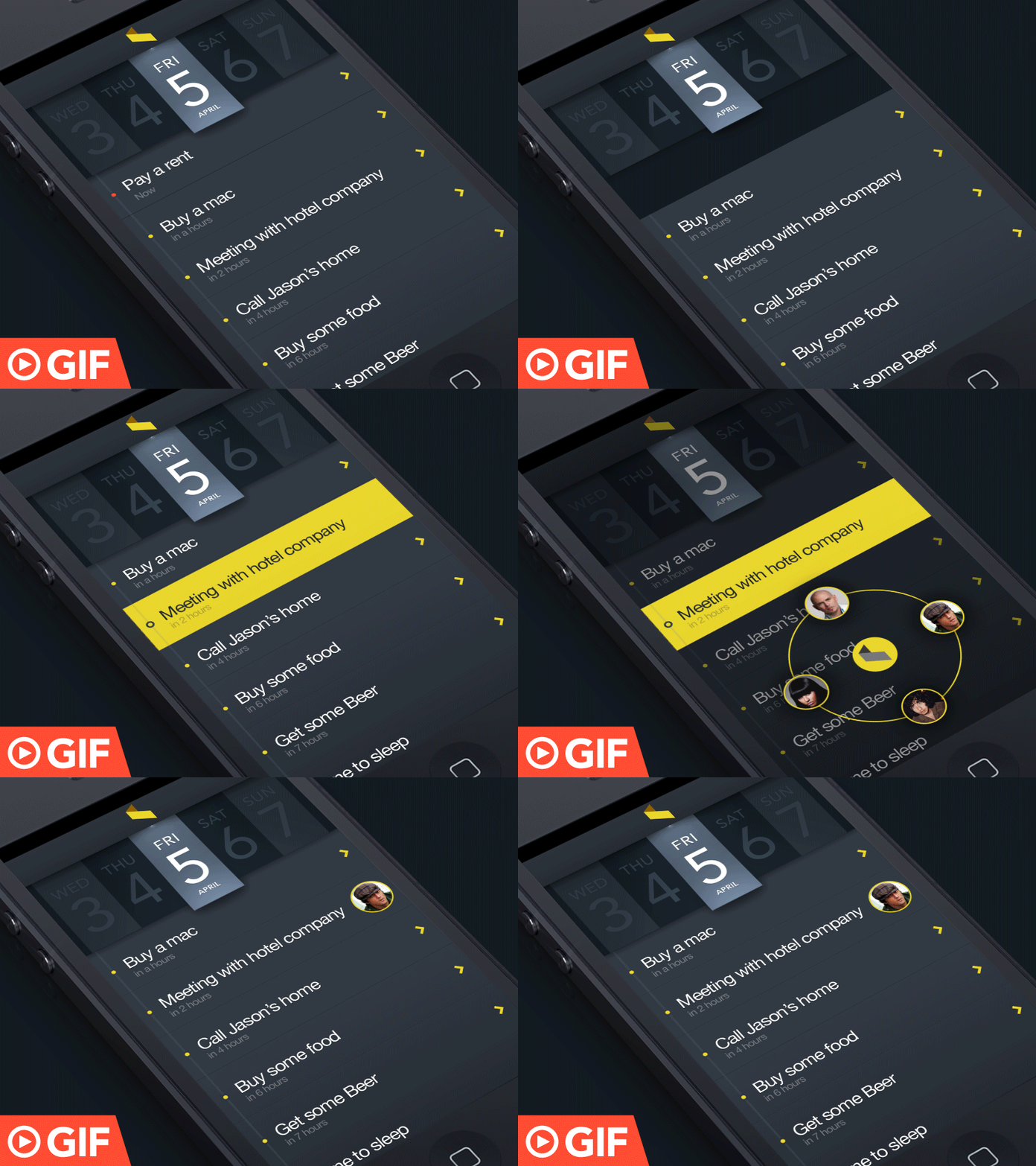
This design is created to demonstrate the swipe technique in action by providing team leaders a great way to delete and assign a task to their team members. The whole process looks quite effective, conventional, alive and engaging. The animations of this design are created using Adobe After Effects.
FaceScan App by George Frigo:
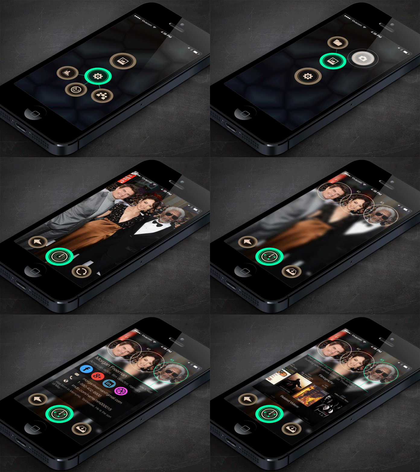
Even though the animation lasts only for 12 seconds in this design, the idea behind this app is pretty clear: making it possible for users to get the latest information about their favorite persons just by scanning their photo. A longer version of this animation in AVI format is also available here to download.
Tour by Mark Geyer:
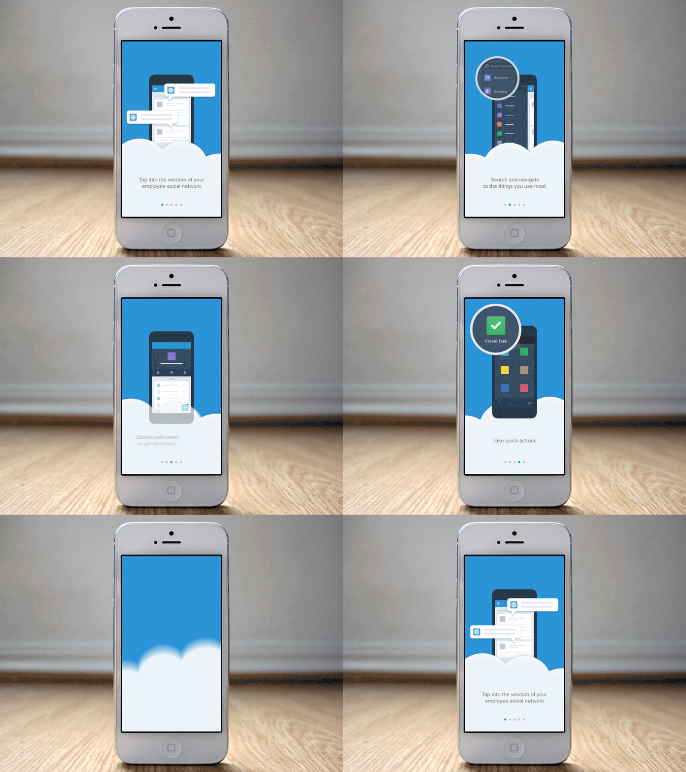
Guided product tours are a great way to make customers familiar with a particular product. This design also introduces an onboarding tour concept for Salesforce customer platform. Before diving into the application, users would be able to take the app tour at their own pace with impressive animations.
GIF for Sport App by Sergey Valiukh:
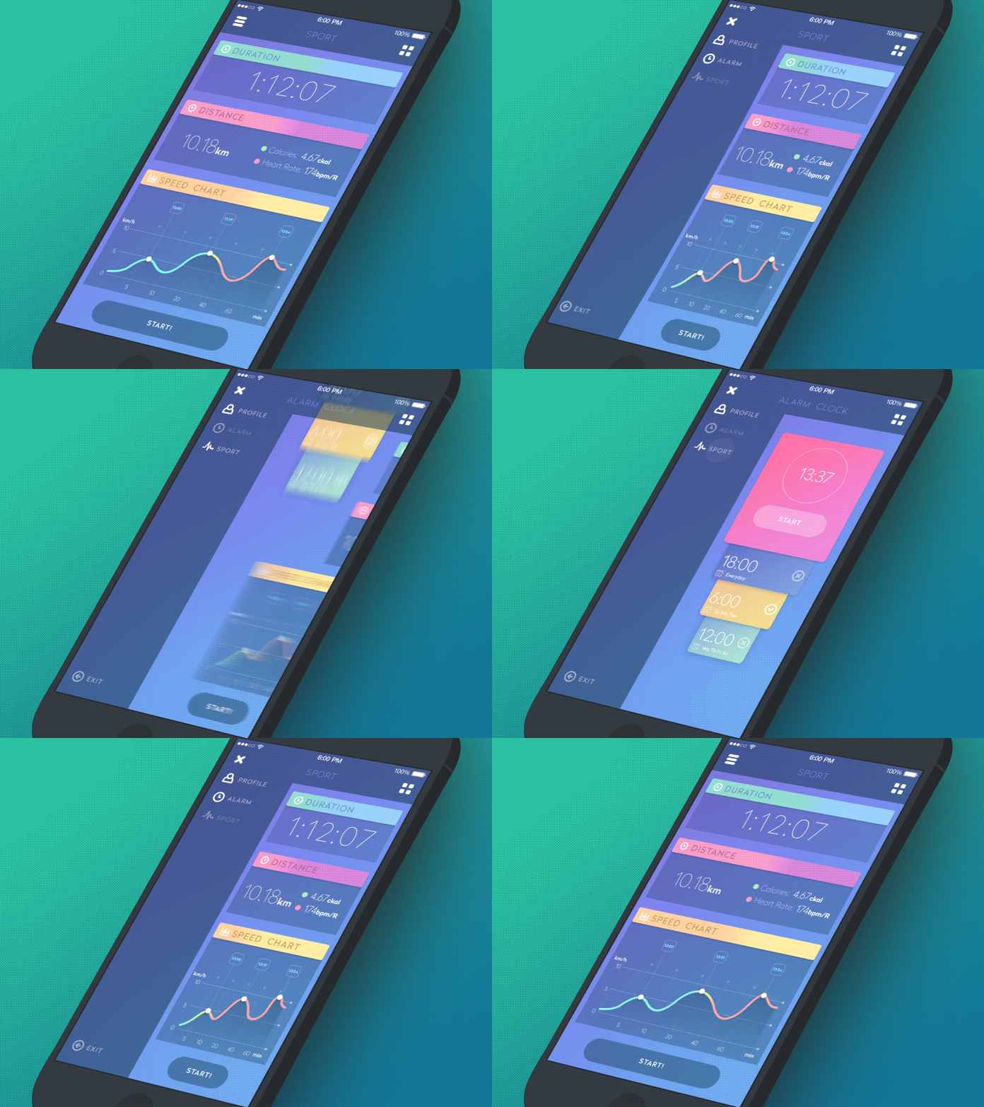
Sport apps, which are quite popular nowadays, are used by many people to save their data and keep track of their overall progress. This app also demonstrates the same functionalities but with some animated interactions. However, the unique animation of this application is the ‘rubber effect’ which appears when you open up the side menu.
Exercise Screen by Vitaly Rubtsov:
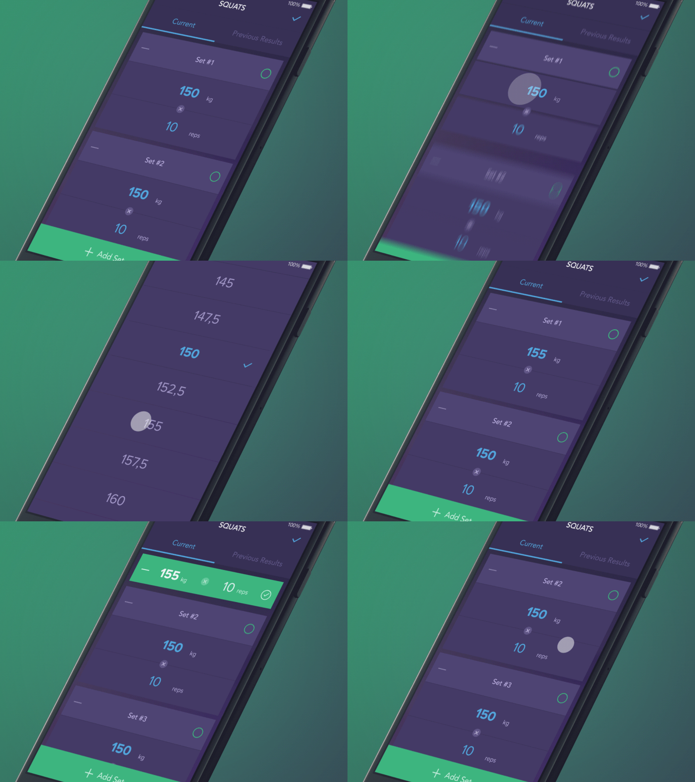
If you’re a health buff, then this app concept will definitely impress you. As you can see in this app, the block shrinks in size and changes its color to green whenever a user ticks the box. This visual feedback indicates the input is accepted successfully and your app is working properly.
Contact List Concept by Eugene Cameel:
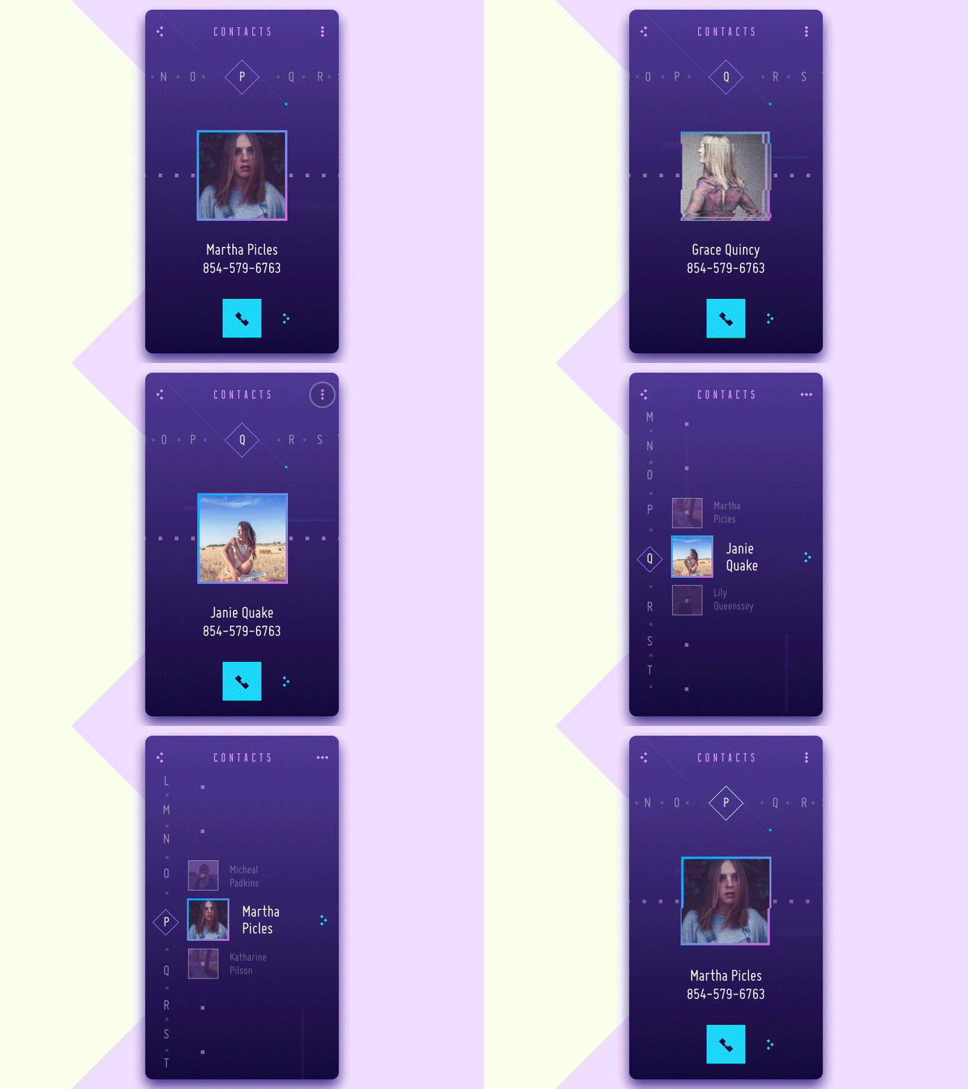
This concept is the animated version of minimalistic-style contact list app created by Eugene Cameel. It offers users two options for scrolling direction (vertical and horizontal) as well as some other basic and advanced interactions to deal with the contacts in the list. Aren’t they really cool and vibrant?
Travel Blog App Concept by Anatoliy Nesterov:
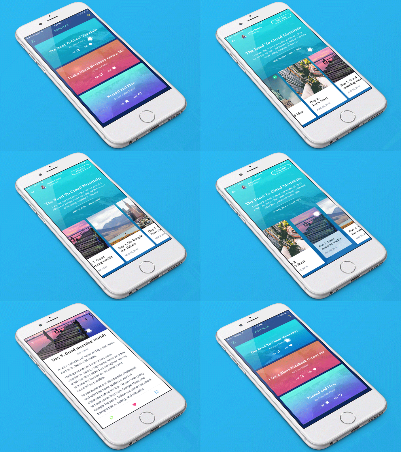
This concept is arguably a unique example of using visual cues to deal with unpredictable interaction patterns within an app. In this example, when the user opens a blog, articles cards show up on the right side of the screen after which the user needs to swipe horizontally in order to go through each card individually. A special 3D touch interaction is used for opening articles in this amazing example!
Android Wear by George Otsubo:
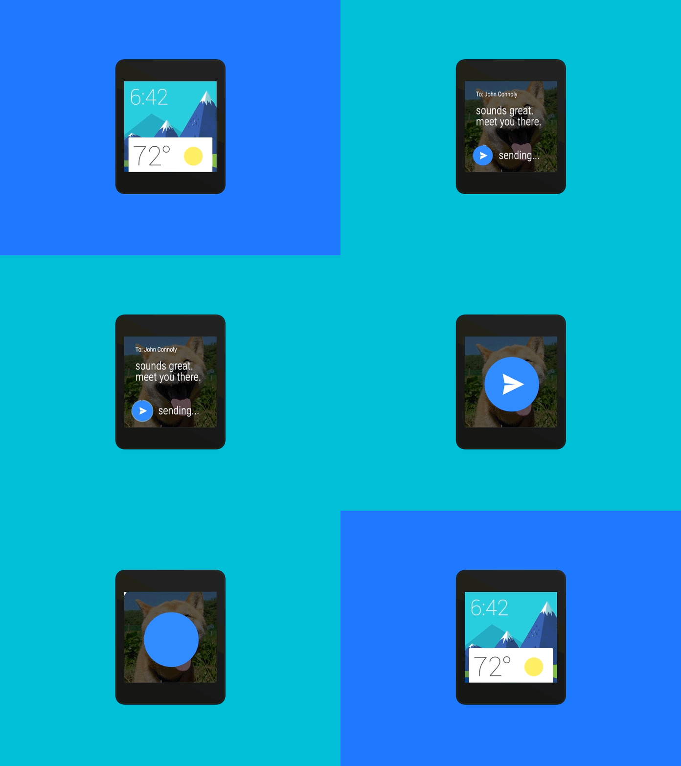
George Otsubo’s redesign of Google’s send animation takes advantage of bright colors to seize a user’s focus on the cheerful motion. Unlike a traditional send notification, the animation is quite fluid and incorporates realistic movements that make the design feel less clunky, slower, and better.
Hopefully, you’ll find this article useful and informative. If you want to incorporate motion design into your business app, we can help you with our prompt and professional PSD to mobile app development service. Contact us to discuss your requirements and get a free no obligation quote.


