Alleviate Mobile Browsing Experience with HTML5, CSS3 and iWeb App Templates
With the changing trends in internet surfing, today almost half of the world’s population prefers to browse the web through mobile devices instead of their Personal computers or desktops. Hence, designing a mobile friendly website has become extremely important. As a website that isn’t mobile friendly may turn painful for the users through a constant use of zoom in, zoom out and scroll functions while browsing.
A responsive website designed using HTML5 and CSS3 technology to run across various desktop platforms and mobile devices have proven to be an ideal solution for mobile utilization, as they are optimized according to the screen size and resolution of the devices.
Here are some of the examples of the templates that are responsive, well optimized for various mobile devices as well as desktops, and are designed using Hyper Text Markup language version 5 and Cascading Style Sheet version 3. Added to this, the templates are accompanied by iPhone web Applications, with an iPhone icon in the homepage especially designed for iPhones. Although the application is especially meant for the iDevice, yet it could be accessed from most of the Smartphone devices that have a wide screen of 320×480px. The addition of this iWeb application in these templates has done away with the need to browse to access an application installed in an iPhone device.
-
Corvina Mobile Template : Crafted using HTML5, CSS3 and jQuery markups, Corvina is a mobile admin template that uses High Definition Retina Graphics. With a swiftly moving, user friendly interface, the template features an inbuilt audio player, that is compatible to the latest versions of mobile operating systems like, Android 2.3 or more, iPhone 4.3 or more, Windows 7 Mobile, and RIM version 7. However, devices supporting HTML5 will also be able to play the audio. Some of the features of the template includes: 10 different home screen icons of the web application in 10 different pages, iPhone 4 and 4S compatible retina Graphics, 10 CSS3 buttons, supports PSD files, Use of Breadcrumb for easy navigation, jQuery powered radio and check boxes, JQuery animated alert boxes, etc.
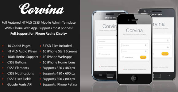
Download Corvina Mobile Template
-
Esepina Mobile Template : This HTML5 and CSS3 driven mobile template has been designed to perfectly fit the screen of your mobile devices and has been preloaded with swipe features. Highlights of this templates includes: iPhone web applications with iPhone icons on the home screen, easy startup screen for the applications without having to browse through Safari, jQuery driven image gallery and notifications, CSS3 buttons and navigations, 100 column icons, AJAX and PHP driven contact form, etc.
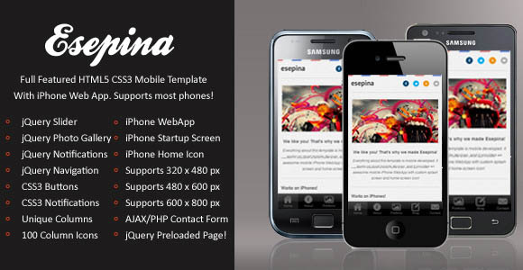
Download Esepina Mobile Template
-
Sophie Template : Designed by Themeforest, Sophie mobile template has been designed using different color schemes and has been styled with different typography. Compatible across all the latest mobile browsers, Sophie embeds the following features: animated dropdown menu, HTML5 and CSS3 driven layout, iWeb application with easy start up screen, different color scheme, Homepage icons of iPhone, supports Google Map, animated tabs and logos, 64 CSS3 buttons for enlarge view, animated hover icon, Social media integration, inclusion of PSD files of the template, content separators, etc.
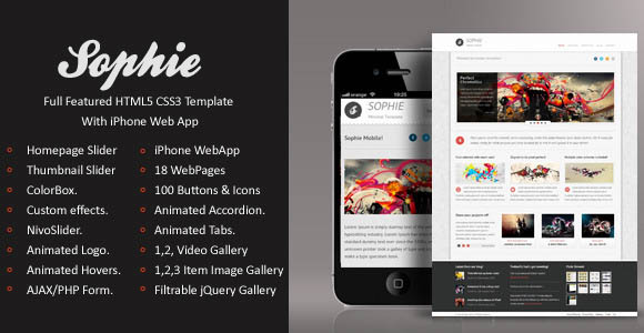
Download Sophie Mobile Template
-
Nobile Template : This HTML5 and CSS3 driven template although appears to be simple, yet it is complex to work on it. Produced by Themeforest, the template offers a unique iPhone application that is not found in any other templates. Its features include: animated hover and logo, inclusion of video and image gallery, HTML5 and CSS3 markups, animated drop down menu, 24 web pages, homepage slider and quote slider, 64 CSS3 buttons, compatible with all latest web browsers.
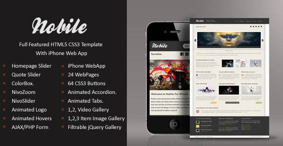
Download Nobile Mobile Template
-
Side Mobile Retina Template : With more than hundred retina elements, retina graphics and retina icons, Side Mobile Retina Template automatically hides the navigation bar in the landscape mode. Capable of providing comprehensive support for iPhone’s retina display, the template features iPhone web applications with user friendly home icons on the homepage. The template also accompanies PSD files of the template with a user manual.
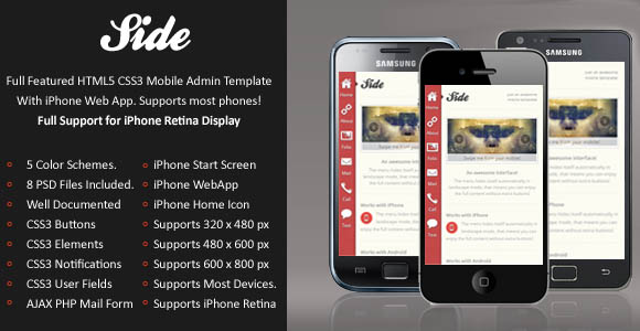
Download Side Mobile Retina Template
Conclusion:
Thus, use of these HTML5 and CSS3 driven templates will not only help to create astonishing responsive web designs for iPhones, iPads and Smartphones, but its inclusion of web applications for iPhone will be an added advantage for the iPhone users. The templates will also provide the web designers and developers with a highly professional website design to keep pace with the rapidly developing technology of the modern world.


