Essential tips to dramatically improve your “About Us” page
“About” page, as the name itself implies, is the page that introduces yourself to your visitors, letting them know the reason of existence of your business. This single page serves an important role in turning your first time visitors into potential customers, capturing new business opportunities, and gaining a deeper appreciation of your site from your regular users.
Believe it or not, building a healthy relationship with your visitors begins with telling them a few things they always want to know: who are you, what do you do, when did you start doing what you’re doing, where are you, and why (or how) are you the one to achieve what you claim to do? An about page works as the platform where your visitors can get answers of these five Ws (who, what, when, where, why) without any trouble.
Why it matters?
If you’ve ever checked your stats using service like Google Analytics, you’ve noticed that your “about” page is probably one of the most visited pages of your website. This shows, why having an about page on your site is so important and how people try to know more about you and your organization from the about page. About page plays an important role in branding your business, creating a positive public image for your company, and building relationship with potential customers and make your business stand out from the crowd.
Elements of a Brilliant About Us page:
All of the top-notch about page designs employ a combination of the following elements. We suggest you to put all these things on your about page to build trust and credibility with your visitors.
- Try to make the copy on about page informative, authoritative, and fascinating.
- Explain who you are and what you can do or offer.
- Write appealing content in a conversational tone. Be original, warm and approachable.
- You can also add a short and sweet video, demonstrating your expertise in your field. But don’t have it start playing automatically.
- To assure your visitors that your company is legitimate, add logos of your past/existing clients, some testimonials, and other authenticity statements.
- Badges indicating your strong points, awards, tie ups, publications, certifications, and so forth make nice additions to the page.
- Include a brief introduction to founder of the company. Also add pictures and bios of team members and senior management.
- Don’t forget to add important details like date of incorporation, office location(s), and team strength.
- Add links to your professional social networking profile to begin building relationships and grow your online network.
- Also, highlight your company’s facts and major achievements. Provide title to each section.
- Make sure this page has correct and updated details regarding you and your company. So update the page whenever needed.
- Provide a solid reason for your users to choose you. Tell your visitors what makes you different from others in your field and why they should put their faith in your services.
5 Great Examples of About Us Page:
Though everyone has their own perspective on creating an about page, but here we’ve analyzed five of the stunning and well designed “about” pages and explained why they are better than the rest. Learn about essentials of an excellent about page through these 5 real-life examples and also get an idea as to how you can emulate the best things of these pages on your own website.
# ZURB:

Why it’s brilliant:
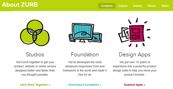
- First they’ve explained their reason of existence in “why they’re in business”, and their achievements by providing stats like “generated over $1.6 billion in market capitalization”.
- Then elaborated what they do very well by categorizing their services in 4 sections: Studios, Foundation, Design Apps, and University.
- Created manifesto which validates their knowledge and experience, and also builds trust with users.
- Team members’ pictures to provide personal touch.
- Displayed live, latest tweet.
- Providing links to their social networking profiles, they’re taking full advantage of social media to grow their online network.
# Mammoth Media:

Why it’s brilliant:
- Nice and very interactive layout.
- Instead of boring formal page, they provided details regarding their location, work ethics, and style in more friendly and personal way.
- Provided information regarding their services and again explained it very well.
- Providing logos of their clients and having name – like MacDonald’s, Beck’s, MetLife, Red Bull – builds immediate trust and credibility.
- Added an industry-related quotation to impress visitors.
- Best of all, the copy on this page is very intriguing and conversational.
# The Omni Group:

Why it’s brilliant:
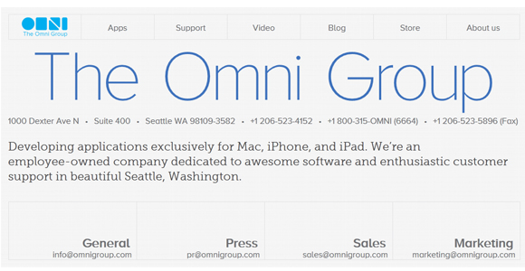
- Very well explained who they are, services they provide, reason to choose them, and their location in one small paragraph.
- Contact details provide a way to get in touch with Omni group.
- Showcasing awards build credibility and trust.
- Added Team members’ picture and bios, which explains their experience.
- Page content is written in a storytelling style, so visitors can connect with it more.
# Shopify:

Why it’s brilliant:
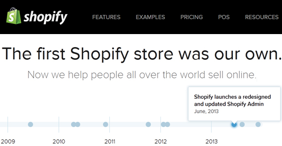
- Nice graphical way to show major achievements.
- Message from Daniel Weinand, company’s Co-founder makes it personal and shows the vision and enthusiasm of the senior management.
- Important details –such as date of inception, no. of employees, and total funding – are displayed in numbers, which let visitors quickly know about their organization.
- Real time update on product sold provides a sense of trust.
- The beautiful slider, showing their workplace culture, gives talented people a reason to join their team.
- Team members’ pictures with their twitter profiles encourage online networking.
# Nurun:

Why it’s brilliant:
- Spectacularly represented who they are in a single line.
- Provide links to official social media profiles, Nurun invites and encourages visitors to make connection.
- Displaying address with link to their location on map, the company has made an effort of giving an evidence of its legitimacy to their visitors.
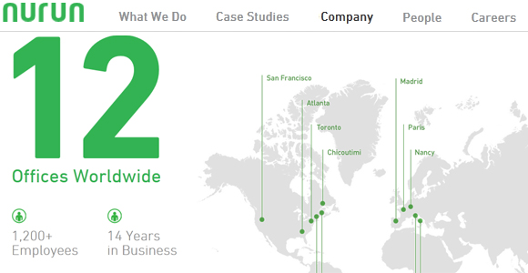
- Like Shopify, Nurun has also shown significant details – like how many offices it has worldwide, total no. of employees, and experience in industry – in numbers.
- Mentioning their areas of expertise clearly lets visitors immediately understand what the company does.
- Blocks, showing the location of company’s different offices with phone and email id, attracts more local clients.


